Three directions

One website. Your call.

Hello, Footprint Podiatry. We made you three fully working websites.

Each direction is built and live — pick the one that feels right, choose your package, and we'll handle everything from here.

Prepared for Footprint Podiatry
By Eureka Studio
Directions 3 options
Decision by Tue, Jun 30
01 / Directions

Three ways to take Footprint Podiatry online.

Each is fully built and live. Click any preview to walk through the real site — no mockups.

Option A — The Clinical preview
Option A Conservative
The Clinical

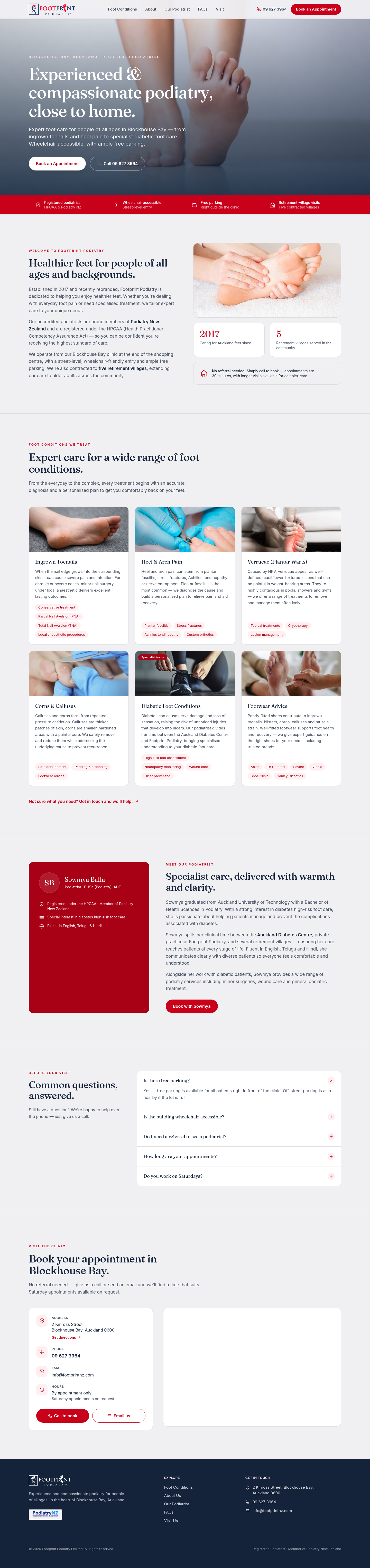
Clean and professional — white space, clear credentials, and a trustworthy tone that feels right for a healthcare practice.

Walk through →
Option B — The Modern preview
Option B Modern
The Modern

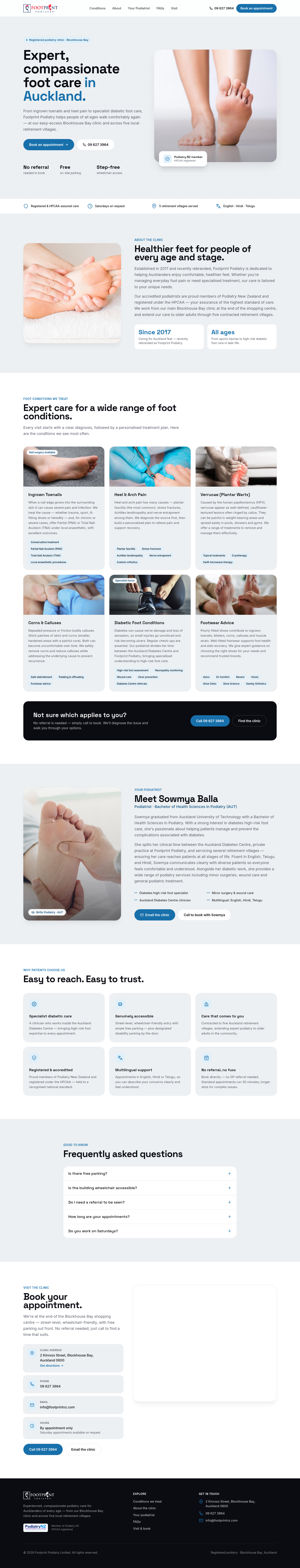
Contemporary and engaging — bold typography, clear patient journeys, and a design that stands out among Auckland clinics.

Walk through →
Option C — The Bold preview
Option C Striking
The Bold

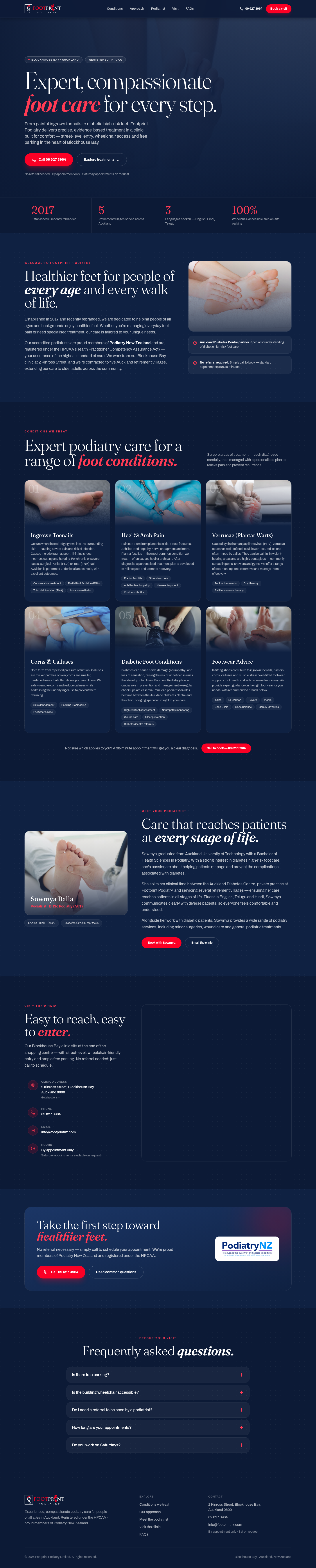
Confident and distinctive — navy and brand red, commanding authority, built to leave a lasting impression on every patient who visits.

Walk through →
02 / What changes

More patients find you. More patients book.
Here's what's different.

What changes — in plain terms, no jargon.

Found when locals search for a podiatrist
Roughly 500 words on your homepage — harder for new patients to find you
1,500+ words of relevant, location-specific content — far more visible in local search

People searching "podiatrist Blockhouse Bay" or "Auckland podiatrist" are much more likely to land on your new site first.

Booking button always one tap away
Call button disappears when you scroll down the page
Contact button stays visible at all times, on every device

When someone is ready to book, they shouldn't have to scroll back up to find your number. Fewer steps means more appointments.

Your credentials and team front and centre
Podiatry NZ badge and qualifications appear further down the page
Sowmya's qualifications, registrations, and specialist focus shown upfront

Patients choose who they trust with their health. Showing credentials immediately makes that trust decision easy.

Currently on your homepage
A general welcome paragraph
Six service cards with short descriptions
Footwear brand logos (without clickable links)
Four "Why Choose Us" bullet points
A phone number to call
No testimonials or patient reviews
No pricing or appointment cost information
Credentials visible only after scrolling
On your new homepage
A clear headline that speaks to your ideal patient
All six services with full detail and conditions treated
Sowmya's bio, qualifications, and specialist expertise
Podiatry NZ, HPCAA, and diabetes centre credentials shown early
Clinic address, hours, parking, and accessibility at a glance
FAQs covering both logistics and common treatment questions
Prominent call button always visible as you scroll
Five retirement village contracts and multilingual care highlighted
More people in your area find you when they search for a podiatrist in Auckland More traffic
Patients immediately see your qualifications and registrations — trust established in seconds Higher trust
One tap to call from any point on the page — fewer people leave before getting in touch More bookings
Your website lives on its own domain — no platform lock-in, fully owned and portable You own it
Looks great on phones, tablets, and desktop — exactly how most patients browse Mobile ready
Clinic address, hours, and directions visible without clicking through to another page Faster contact
ACC information and appointment expectations set in advance — patients arrive prepared Clearer pricing
03 / Decide

Which design, which package and what hosting?

Pick the option that feels right for you, and we'll take care of the rest. No technical knowledge needed — we handle all the tricky bits.

ADirection
BPackage
CHosting
Select a direction, package, and hosting plan to continue.